Ordering Coffee During COVID
How do you shorten drive-thru lines while reassuring Starbucks loyal customers of Covid safety precautions?
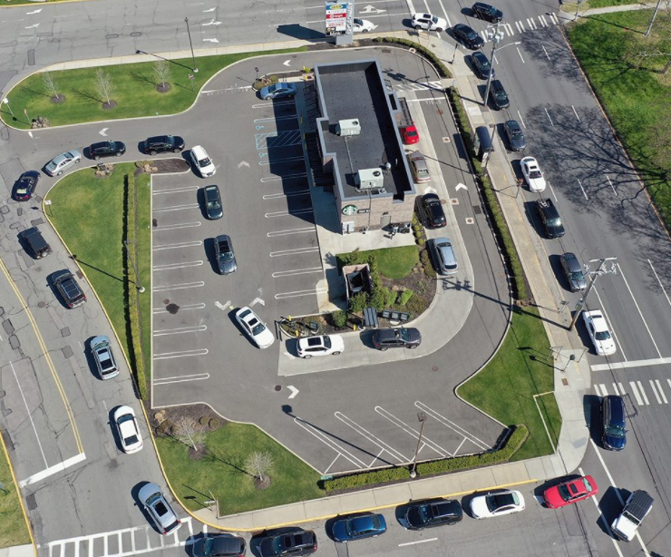
In December 2020, Starbucks had drive-thru lines wrapping around street blocks as customers flocked to contactless ordering options.
During my two-week General Assembly UX Design bootcamp, I led a team of three designers to design a solution to relieve frustrated Starbucks customers that met both the business needs and customer needs.
No time? Watch this 5 minute overview video.
TL;DR
I also have a short overview of the key project information if you’re not keen to read through the rest of the case study.
-
TEAM
I was part of a team of three UX design students. We all shared responsibilities across research and design, but I was the lead for the project.
DURATION
12 days, full time from start to project presentation
DEVICES & PLATFORM
We created a mobile ordering user flow for the Starbucks mobile app.
As a company with a very well established design system based on Google’s material design, we chose to align our designs with the official pattern library and integrate the new user flow within the current app. -
Long drive-thru lines were a severe problem for Starbucks. Unending lines dissuaded new customers. They would see the sweeping line and not bother entering the cue. At the same time, unclear COVID safety precautions kept Starbucks regulars from ordering. They were making coffee at home instead.
How could we attract new customers but also keep the Starbucks regulars happy?
I led a team of 3 to design a solution to relieve frustrated Starbucks customers and employees. Our mobile solution met both the business needs and customer needs.
During the two-week project, my team all wore various hats. Together we conducted research and designed solutions. We tested our design and iterated through many answers to the problem. Below is a summary of our work separated into four sections:
Research
Design
Iterate
Conclusion
-
USER INTERVIEWS
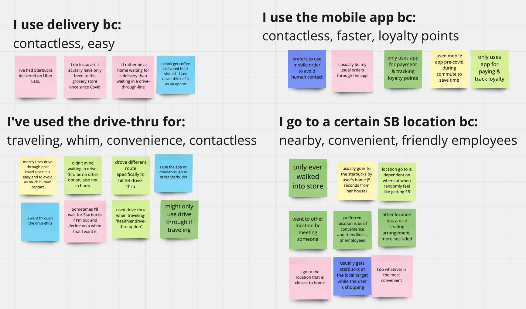
We conducted six user interviews with Starbucks customers. We wanted to know how their behaviors had changed during COVID and what their concerns were. From affinity mapping insights, we learned:
Starbucks Regular customers weren't concerned with long wait times
The lack of clarity around covid safety measures troubled Starbucks regulars
Lengthy lines discouraged new or infrequent customers from ordering
PRIMARY PERSONA
User interview insights helped us create our primary persona, Melody. She was the loyal Starbucks customer who had a favorite and Starbucks location. She would chat with the friendly employees who knew her and what she always ordered.
COVID had changed her weekday Starbucks ritual. She couldn't find information about her local shop's COVID safety measures. She thought it was both safer and easier to make coffee at home. Melody wants to feel reassured that it is safe to order before she returns to buying her daily drink.
SECONDARY PERSONA
Our secondary persona developed from our user research is Terry. He is the occasional Starbucks customer that orders Starbucks when it is convenient. Terry wants coffee to be ready fast. He is not willing to wait very long. If there is a long line, he will pass up the opportunity for a Starbucks drink that day.
TASK ANALYSIS
The ideal user flow would please both types of customers. Task analysis would help test the weaknesses of the current ordering process.
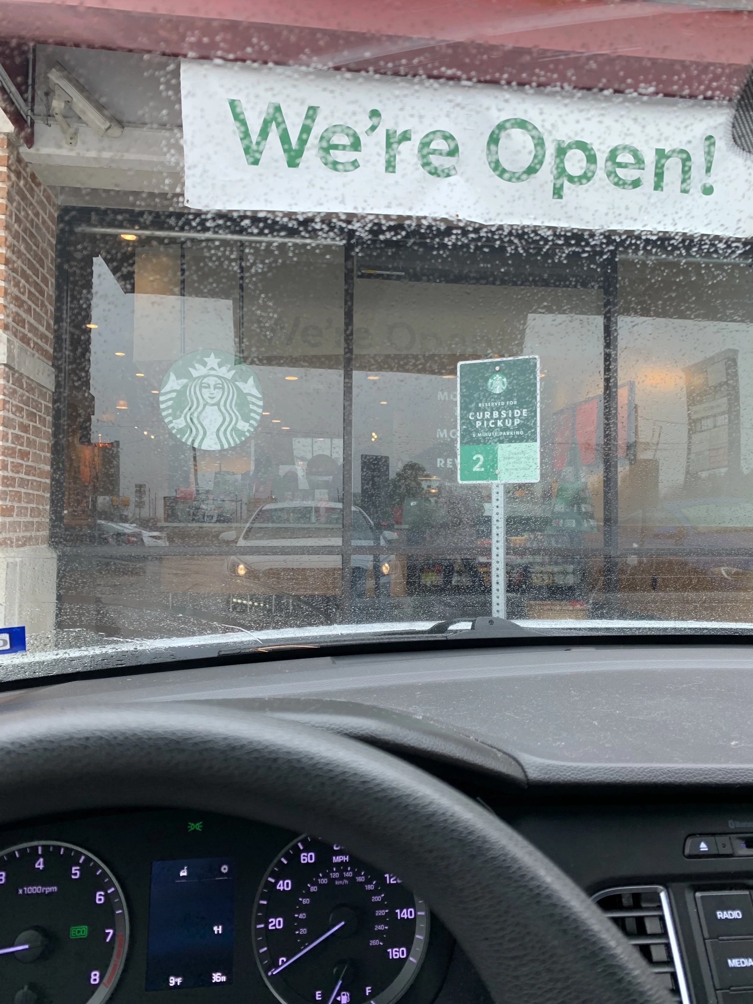
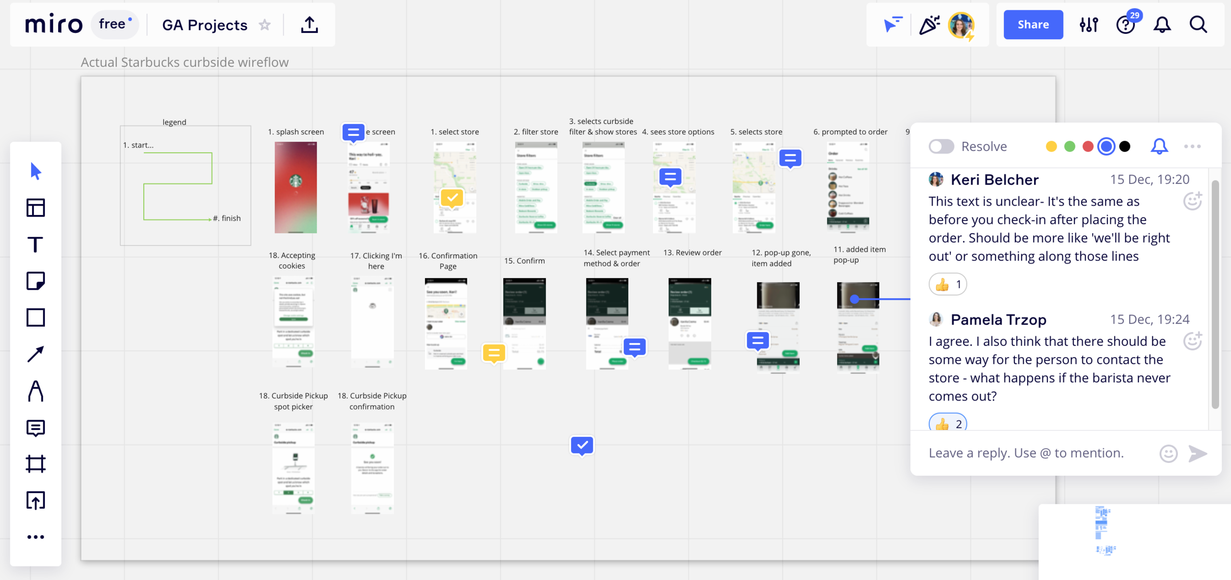
I performed a task analysis of the curbside pickup method of ordering a drink. That ordering method is a contactless ordering option and thus ideal for COVID. It might also remove customers from the drive-thru line. We found that the app had:
limited information on curbside instructions and covid safety measures
confusing navigation and wording for the curbside process
We kept these insights in mind when we went into the ideation phase.
DEFINING THE PROBLEM
Our research findings contradicted the initial hypothesis that long lines were the problem. COVID precautions concerned the majority of Starbucks customers more than long wait times. Retaining loyal Starbucks customers is cheaper than acquiring new customers. Thus our solution needed to address our primary persona's concerns about COVID safety.
It was also possible to address the frustrations of new or infrequent customers at the same time. Our solution could also decrease the wait time and make our secondary persona happy—no need to lose potential customers.
-
DESIGN STUDIO
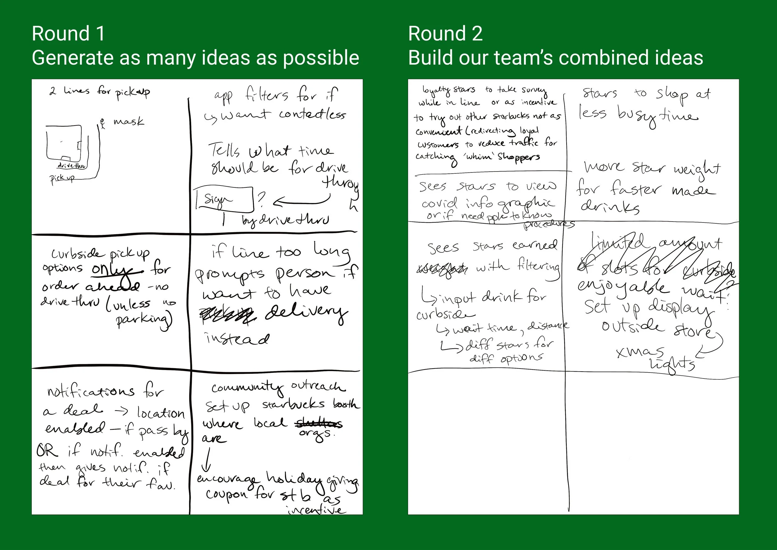
We wanted to solved for Melody's pain points, our loyal customer, as well as Terry's, our occasional customer, so that we could retain loyal customers while still addressing the business problem of losing potential customers. We conducted a design studio to try to come up with solutions. Based on the design studio, we decided to incorporate key items into the design:
Clarifying Starbucks' COVID response
To slightly modify loyal customer's actions with star rewards as an incentive
Scheduling drinks for curbside pickup for a specific time in the future
Redirecting users to other locations with shorter wait times
USER FLOW
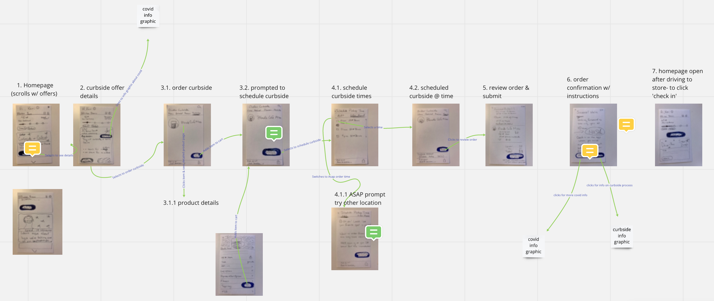
From our design studio results, we developed a user flow for Melody where she can quickly find the information about COVID safety on the homepage to feel reassured that she is safe to order. Then she would see an offer on the app home screen that would incentivize her with stars to schedule her daily drink order ahead of time using curbside pickup.
LOW-FIDELITY WIREFRAMES
After creating the low fidelity wireframes on paper and critiquing them as a group, I drew a second iteration of paper prototypes so that we could use them for a first round of usability tests to get early feedback on the direction of our design. We learned valuable insights that were then incorporated into our high-fidelity prototype including:
An icon for COVID information was unclear
Keeping the UI of Starbucks consistent
Maintaining on-brand UX copy (we imagined as if Tom Hanks were the voice- friendly & reliable)
HIGH-FIDELITY WIREFRAMES
Once we had validated the userflow that we had created for Melody based on the positive results from usability tests from paper prototypes, we started designing our high fidelity wireframes following the UI design system Starbucks uses. For the COVID infographic, I created elements of visual rest by spacing minimal text with simple images to create a mobile-friendly version of Starbucks' COVID information that's currently on their website in a very dense and text-heavy format.
-
Yep.
USABILITY TESTING
Once we had our high-fidelity wireframes prototyped, we conducted usability tests to identify if there needed to be any changes that would improve the function of the app and user-satisfaction. We tested to see if users could:
Easily find the COVID safety information
Find and understand the incentive to use the scheduled ahead method of ordering curbside pickup
Complete the curbside pickup ordering process
Find information for contacting the store
ITERATING
Based on our results from the usability tests we:
Reordered the covid infographic so that the most important information was at the top (contactless options)
Moved the call to action button for the incentive above the fold so that users knew where to go
Reordered the final pickup confirmation page to show the contact information in a more prominent location
-
NEXT STEPS
The prototype was a result of the two week design sprint, but additional items could still be addressed if more time were available. Those items include:
Conducting a round of research on the usability of the latest prototype but focusing this time on the navigation and flow of the ordering process
Additional research and ideation could be done for how to address when users need to make more complicated orders (more than one or two drinks)
Building out the delivery user flow that was designed for our secondary persona who was driven by convenience
LEARNINGS
On teamwork and collaboration:
If there's disagreement over design direction, building off of the other team member's seemingly opposite idea helps to build trust through respect and validation and can help steer the design in a mutually compromised direction
Miro is a fantastic tool to use for virtual group affinity mapping, group project critiques, and creating user flows as a group
Figma is great for collaborating in real time to build out wireframes and the prototype
Daily standup in Slack (which you can set up a daily reminder for) is super helpful to make sure every team member is aware of what the others are have done and will be working on that day. Plus checking-in with each other helps find any issues teammates might be facing and can help the group assess how to tackle any road blocks.
On Project Management:
This is so essential. Without a solid plan for what needs to get done, when, and by whom, things can go majorly awry. Make a plan, use it, and update it on a daily or on an as-needed basis.
Unending drive-thru lines were a problem for Starbucks.
During the peak of the pandemic, long wait times were dissuading new customers who would see the sweeping drive-thru line and not enter the cue.
Our initial hypothesis at the start of the project was that those wait times were causing frustration among both employees and customers. From user research, we found the true story to be more complex.
Picture from a drone showing 20+ cars in line for the Starbucks drive-thru in late 2020
We broke the scope of our study into 3 phases
-
The first phase was for research to discover and define the challenges Starbucks is facing
-
The second phase was an initial ideation & design phase to develop a low fidelity prototype to test our initial solutions
-
The third phase was testing the high fidelity mobile prototype and iterating our solution based on user feedback.
We also had to factor in time for the deck building and presentation practice. We also worked extra time time into our project schedule to allow for last minute fixes to any issues that might arise towards the end of the project.
Phase 1 - Plan, Discover, Define
The problem wasn’t what we were expecting
User Interviews revealed a different story
We conducted 6 user interviews to investigate Starbucks and coffee drinker’s concerns and behaviors both prior to- and during COVID.
Infrequent Starbucks customers were frustrated with long wait times. However, many longtime Starbucks customers were not bothered by long wait times.
“Everyone had to go to the drive-thru because of COVID [...] We were hungry, we were here, and the line was moving. It was a fairly long line, but we wanted to get breakfast.”
— User Interview Participant, a Starbucks regular customer
Two user groups emerged from the data
STARBUCKS REGULARS
This was our primary persona. We named her Melody. She was a longtime Starbucks customer who had a favorite location where she would grab her daily morning coffee before COVID.
But during the pandemic, her routine changed dramatically. She still wanted to get her daily coffee fix, but her main concern was knowing what COVID safety precautions her usual Starbucks location had in place. Was it still safe for her to order coffee?
INFREQUENT STARBUCKS CUSTOMERS
This was our secondary persona, who we named Terry. He would buy a Starbucks drink when it was convenient. His main motivator was being able to order and receive his drink quickly.
He wasn’t a fan of waiting in long lines. A long line meant he would simply not order from Starbucks that day.
Filler image- visual comparison of two users
Redefining the problem.
Our research findings were at odds with the original concerns. The main Starbucks customers were less concerned with wait times than they were with COVID precautions. To retain the loyal Starbucks customers, we wanted to design a solution that would address our primary persona’s concerns about COVID safety.
However we wanted to do it in such a way that we might also address Terry’s, our secondary persona’s, frustrations so that we would not lose out on potential customers that would be dissuaded by long wait times.
How could we accommodate both user types?
A task analysis of curbside mobile ordering
To help us inform a user flow that would satisfy both customers, we decided to a perform further research in the form of a task analysis. We chose to analyze the steps for the newly introduced curbside pickup method of ordering since it is a contactless ordering option that would also potentially remove customers from the drive-thru line.
We found that the app had limited information on curbside instructions as well as covid safety precautions. Additionally the curbside pickup process had confusing navigation and wording.
With these insights in mind, we went into the ideation phase to develop potential solutions.
Phase 2 - Ideation and Design
Is there a solution that meets both user and business needs?
A Design Studio Approach
Rapid ideating blended with critique
We had a design studio session where all three team members brain stormed solutions that might meet the concerns of both users. We wanted a solution that would both retain loyal customers without losing out on potential customers from long waits.
The first round of brainstorming involved generating as many ideas as possible then sharing our ideas with each other. The second round involved stealing the best ideas from each other to generate new, improved ideas.
We found ways to meet different user’s needs
For the Starbucks regular customers
1. Clarify Starbucks’s COVID response
This needed to be super clear and easy to scan. The current information was buried deep on the app and then brought the user to a webpage with lots of text that was difficult for a user to quickly learn about Starbucks’ COVID precautions.
2. Modify behavior with Star Rewards as an incentive
Insights from user interviews showed us how important the Star Rewards were for loyal customers. We hypothesized that incentivizing customers with Star Rewards to modify their behavior slightly might work. The idea was to offer rewards when a customer chose to use schedule their pickup ahead of time
For the infrequent Starbucks customers
1. Reduce the size of the lines
Our idea was to reduce those waiting in the drive-thru line by offering scheduled pickup times for curbside with the incentive of Star Rewards. Knowing that wait times didn’t matter as much to loyal customers based on user interviews, we hypothesized that we could change their behavior slightly using something that they cared about- the Star Rewards- thereby relieving the drive-thru of a crowd rush. We wanted to make the lines shorter so that they were once again convenient for the infrequent customer who cared about easy and rapid service.
2. Redirect users to other locations
If a user came across a long drive-thru line, we wanted to make it easy for them to find another location. The idea was to give estimated wait times for the other locations so that they could find other locations with short wait times.
How to modify the current user flow?
Analyzing the current mobile app flow
I took screenshots of the individual screens during the task analysis of the curbside mobile ordering process. In Miro as a group, we critiqued those screens and used them as a basis for revising the new user flow.
Phase 3 - Usability Testing and Prototype Iteration
Usability testing was done often and early
Critiquing each other’s low fidelity wireflows using Miro
Low fidelity paper wireframes provided a means to rapidly iterate on a solution
Usability Testing early in solution development
We all came up with a paper wireframe for developing the user flow. We critiqued those frames using Miro and made a single paper prototype that combined the elements we had agreed were needed. We used the second paper wireframes as a low fidelity prototype for early concept validation and usability testing.
We learned that
Using an icon for COVID was unclear to users
If the UI strayed too far from the well known design patterns, it caused confusion
We needed to maintain consistent with the on-brand UX copy
Conclusions & Learnings
Final thoughts of the project
-
Our solution revised the mobile ordering flow, balancing business and customer needs. First, a scannable COVID infographic would reassure loyal customers ordering was safe. Then a Starbucks Rewards offer would incentivize loyal customers to order. The loyal customers would earn stars if they scheduled curbside pickup ahead of time.
That ordering method would space out the ordering times, thus decreasing drive-thru lines. Drive-thru customers would also have the option to be re-routed to less busy locations.
-
If I had more time, I'd like to interview Starbucks employees since they are vital users in our scenario.
We contemplated talking with employees for interviews, and I reached out to a local store. However, the store manager said that they would need corporate approval to go ahead, so with the time constraint of the project, we decided to only pursue customers to gain user information.
-
If I worked at Starbucks, I'd like to collaborate with a data analyst to validate the solution. I'd collaborate to define what data to collect, the hypotheses to test, and the metrics for success.
I would look for the click volume of the infographic and offer. I'd watch for user-specific ordering rates through time and changes in order spacing. Also, A/B testing with one type of customer would help see if the research insights were solid.
-
During this project, there was some disagreement over design direction. I listened to the team member’s concern and worked with them to build off of their other team member's seemingly opposite idea.
We ended up with an even better solution than we initially had. I found that truly listening to the other team member and being curious rather than letting ego get in the way, helped to ease the conflict. Respecting and validating my teammate helped build trust and team cohesion.
Like what you read?
If you want to keep reading, try my other case studies.
Or maybe you’re curious to learn more about this case study? Email me or reach out on Linkedin!
