Constructing a Cosmic Cowboy Shop
Sound As Ever knew who they were as a brand,
but they didn’t know how to design and build a website.
That's where I came in. Starting in April of 2021, I led the brand through the complete process of creating their first e-commerce website using their chosen platform, Shopify.
The journey started with defining their customers and their needs then building a website and its content. The ultimate goal was a website that was as usable as it was delightful.
No time? See the finished website.
My Roles
User Experience Researcher
User Experience Designer
Information Architect
Usability & SEO Consultant
Platform
E-commerce website
Built via Shopify
Duration
6 months
Part-time work
Collaborators
I was the only UX practitioner
2 stakeholders
visual designer
software developer
Sound As Ever is a lifestyle brand inspired by the late, iconic Gram Parsons.
Gram Parsons posing in his iconic ‘Nudie Suit’
The project was two-fold
-
The clients already had a solid understanding of their brand, but the challenge was to help them define and align on a target customer or proto-persona so that the needs of the users informed how Sound As Ever built their online content.
In order to design the website and content around user needs, the client needed to understand how users perceived their unique and eclectic product offerings. What were the user’s mental models?
-
This second phase of the project was the building of the website. The goal was to have a website that worked for both the target customer as well as newcomers to the brand.
The building process involved everything from the navigation, organization scheme of the content, labeling system, what Shopify theme to use, how to modify the theme to better embody their brand, modifying the theme for usability, and more.

Phase 1: Research and Define
Firstly, if you don’t have customers yet, how do you design for them?
Define & align on a proto-persona
“The major value of proto-personas is that they make your team’s implicit assumptions about your users explicit.”
— Nielsen Norman Group - 3 Persona Types
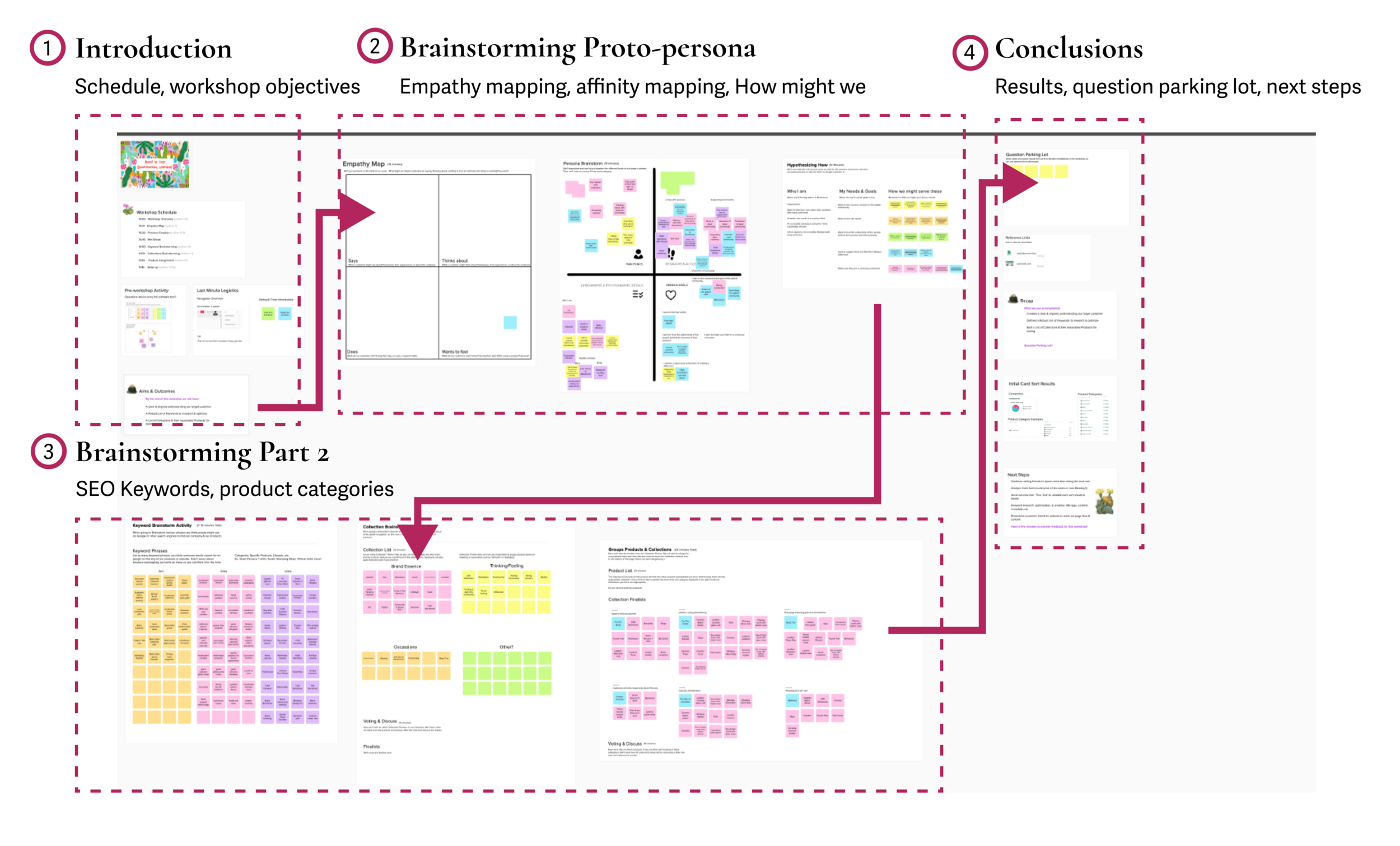
To develop a proto-persona that would guide the building of the website and its content, I created and facilitated a discovery workshop using Mural.
This is an annotated image of the virtual, discovery workshop I conducted in Mural.
Leveraging the stakeholders’ knowledge, we established a proto-persona, or target customer.
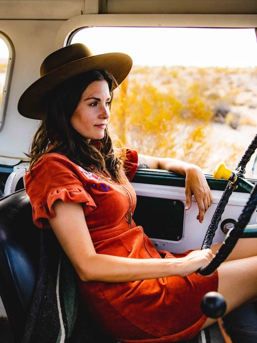
Our target customer- a stylish and conscious consumer, thirsting for adventure and human connection
-
A stylish and independent urbanite who appreciates aesthetics
A socially conscious consumer with sustainability top of mind
A seeker of adventures, experiences, and meaningful connections
In tune with their mental health
-
To support local businesses, especially artists and creatives
To know if businesses they support are authentic, trustworthy, & responsible
To feel connected to others and a part of something more
-
All writing should communicate in a warm, and personable way
Communicate the sustainable practices of sourcing or production of any products when possible
Convey how Sound As Ever supports other creatives and gives back to the community
Transparently describe all products, and address how the purpose of the products are intended for connection and experience
The next challenge was to understand how users perceived the products offered by Sound As Ever.
The uniqueness of the products was their selling point, but it made grouping the products into coherent categories a challenge.
“The first rule of e-commerce design remains: if the customer cannot find the product, the customer cannot buy the product.”
— Nielsen Norman Group - Ecommerce Usability Improvements
Two user research methods were used to gain an understanding of the user’s mental model, which would inform how products were to be organized on the website for best findability.
1. Open Card Sort
-
An open card sort was chosen as a means to discover as much as possible about the thinking and perceptions of users. How would they group products? How would they label them?
-
Conducted unmonitored, virtual open card sort in UXArmy software
60+ products were assigned to virtual cards with descriptive labels and representative images
17 participant responses generated over 100 categories. Some labels created by users were synonyms.
Analysis resulted in 6 categories based on product type
2. Tree Testing
-
I had created six categories and their labels from interpreting the plethora of results from the open card sort. I wanted to validate my solution before building the website around those categories. I also wanted to know what would happen if users were unfamiliar with a product.
-
Conducted unmonitored, virtual tree test using Optimal Workshop
Gathered 22 participant responses which largely validated the interpreted categories and chosen labels
Users were tasked with sorting various products, a mix of both straight-forward and ambiguous product types, into the 6 data-informed product type categories created from distilling the results of the open card sort
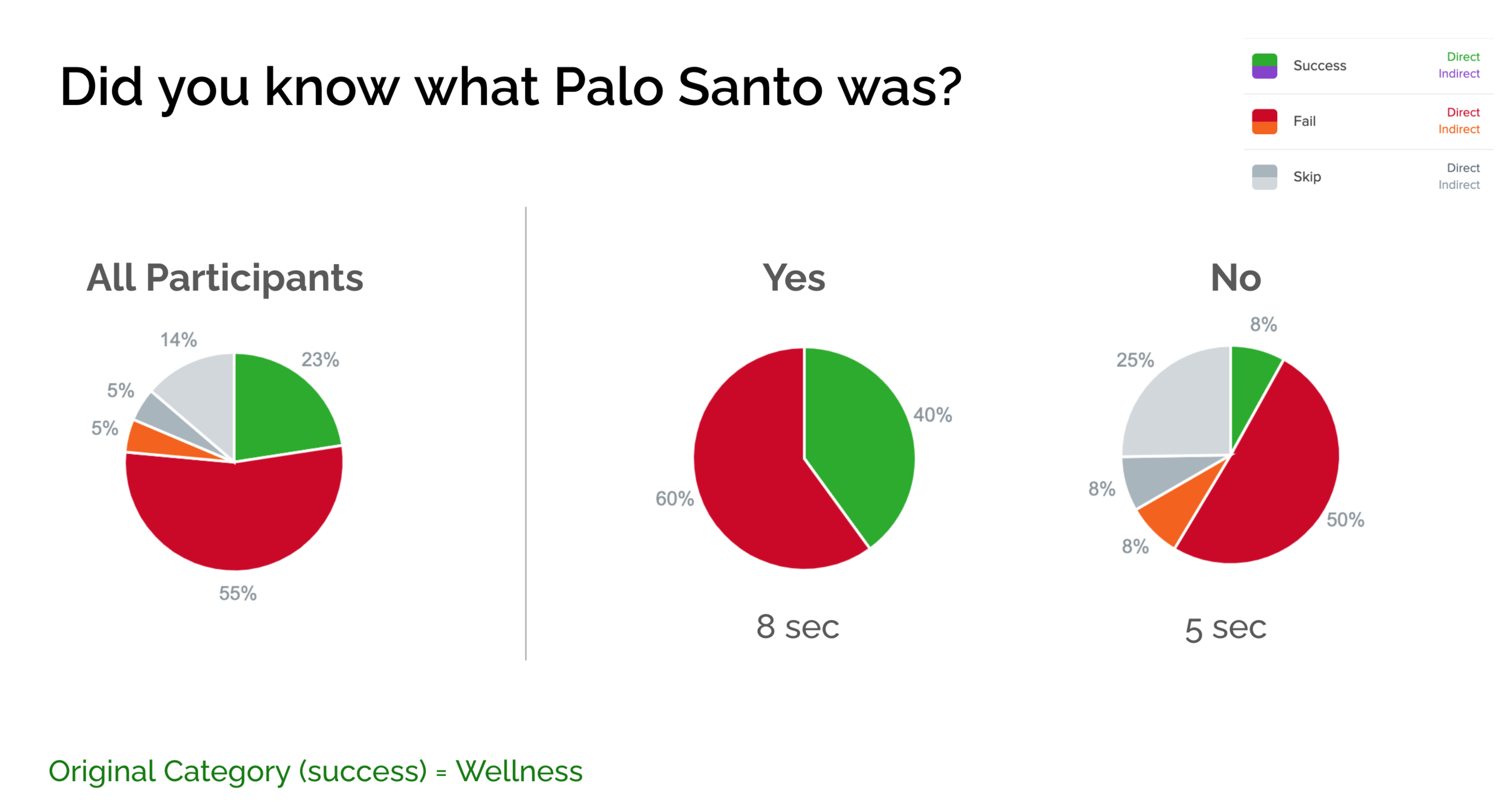
A post-test question was added, asking users if they were unfamiliar with any of the products they had just sorted. The aim was to analyze the results of all participants and of each group to determine if the results differed. One product in particular stood out as an item unknown to over half of the participants - Palo Santo.
Participant results showing an overlap of categories in which they placed Palo Santo, a product that was unfamiliar to over half of participants.
The results validated a topical organization scheme
The tree test study results supported keeping the topical (or product type) categories created by distilling the results of the initial open card sort. However, some changes were made to which products were placed within each category.
The ‘Home goods’ category seemed to be the catch-all category for when users did not know what a product was. The Home goods category was expanded then to overlap some of the other product categories for items that were less well known or more unique, such as the Palo Santo.

Phase 2: Build the website
There were two guiding principles for this phase of the challenge.
-
Can the user find what they need?
-
Can a user quickly and effortlessly complete their objective?
Instead of a lengthy read, here’s two 5 minute videos of the key aspects of the website design
Last but not least, this case study doesn’t cover everything about the project.
-
This was my second freelance project. Every interaction helped me learn how to best interact with clients to meet their needs. I learned to explain my reasons for why I made certain suggestions, sometimes even needing to use non-technical terms or to match my language to the clients so that things were clear.
My role was not only UX Researcher and Designer but also general e-commerce and Shopify consultant, and the client was always curious to learn more. It wasn’t just about the experience I was creating for the users, but the experience I was cultivating through the interactions with my clients.
-
A major part of this 6 month + endeavor was learning how to implement Search Engine Optimization and how to apply it specifically to Shopify and e-commerce. Prior to this project, I knew the basics of SEO, but I learned a ton more in order to become the resource they needed. I spent hours reading about SEO from sources like Yoast, Shopify’s help page, Google, and coursera courses.
Many hours also went into the researching SEO keywords, planning the website content around SEO, and writing or editing much of the information on the site, particularly the product pages.
Like what you read?
Read More
Here’s a link back to all my Case studies
Reach out
Send me a message on LinkedIn
Or Email me questions about this case study


